New enemies & new map
Bugfixes and drawings
Enemies got a face-lift
First, I thought that the more "realistic" look was a good idea for the enemies, but I was wrong. I got feedback that the original colorful placeholder shapes were more interesting to look at than the gray-colored enemies. I tried to add more colors for the enemies by creating them "eyes" with the color they represent, but because of the fast gameplay in my game, it was not enough, and enemies just fade in with the background or with each other. So you could not really tell which one was which. So, I tried to add more colors, and I actually like these myself a lot.
Here is every original version of the enemies and then the new colorfully one.


The background
I also created the very first version of the level background. I have plans to do multiple different backgrounds with different color themes and such, but here is the first one.

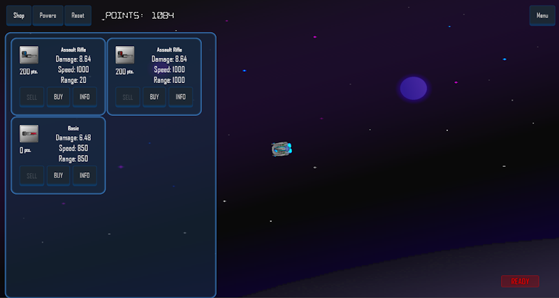
Bug fixes
Lots of different bug fixes were made here and there. The shopping/upgrade system and its UI are now up and running.
I also looked into the blurryness problem, which I mentioned a few posts ago, and I might have found the solution. But this is still at an early stage, and I have to test it a bit more. I probably have to lower the object's velocity to get this fixed, but I'll try different things to still keep the game intense.
That's all for now. Happy Summer!
-Teemu, TheAspen